
Restaurants and cafés
How to create clear digital menu boards for your restaurant
From organizing your menu to checking the display during a busy service: practical steps for clear menus you can update from one place.
Key takeaways
- Make item names and prices the easiest things to read.
- Match each branch’s menu schedule to its actual serving hours.
- Test content and compatibility on a real display before rolling out.
Start with what customers need to order
A customer at the counter wants to know what you serve and how much it costs, then make a choice. A good digital menu board makes that easier. A screen crowded with pictures and moving headlines can make the menu harder to read, even when the design looks impressive.
Before opening your design software, list the items that need to stay visible, the available extras and the approved prices. Note what changes between breakfast, lunch and evening service, and what differs by branch. This gives you a useful structure for the menu instead of trying to fit every product onto one slide.
Design for the screen’s position and viewing distance
A design that looks clear on a laptop may be unreadable from the back of the queue. Stand where customers actually order and try reading the item names and prices. Check lighting, reflections and screen height as well as font size.
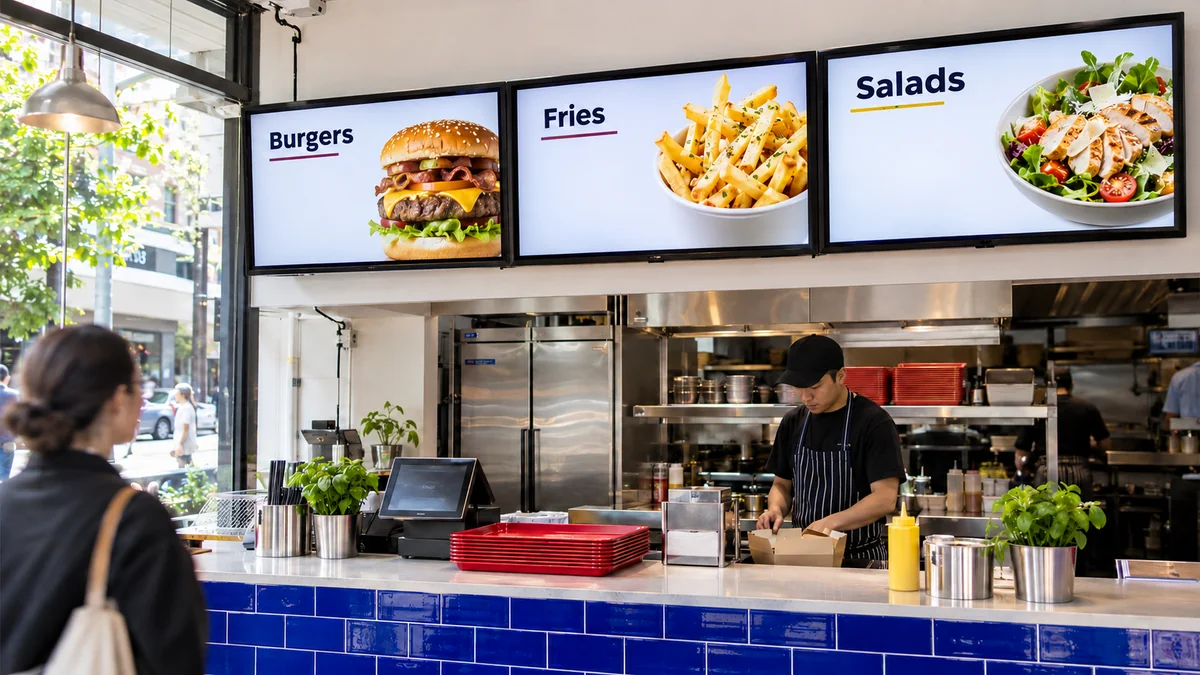
With three screens above a counter, you could use one for meals, another for drinks and the third for extras or today’s offer. That is one possible arrangement, not a fixed rule. Test it against your menu and the space on each display. Keep essential names and prices visible long enough to read; customers should not have to wait through a long advertisement to find the price of their order.
- Use a readable typeface and strong contrast between text and background.
- Group similar items and use a consistent format for prices, sizes and extras.
- Include any food information or notices required for your business in the artwork.
- Test Arabic and English versions if your branch’s customers need both languages.
Prepare images and prices before uploading
Choose photos that represent the food customers actually receive, with simple backgrounds that leave room for text. One clear image of a dish can serve the menu better than several small pictures. If you use video, keep it short and test it on the display itself. Playing successfully on a computer is only the first check.
In the workflow described here, you prepare product names and prices in your artwork, then upload the files to RechSign. Changing a price at the till does not automatically update that artwork. Any point-of-sale integration needs a separate compatibility check. Before publishing, ask someone to confirm that screen prices match what customers will be charged.
Build playlists around your serving hours
Create a playlist for each service period that needs different content, then choose the displays and schedule from the dashboard. Base the timing on when the kitchen can serve the food. When breakfast ends, it should stop appearing on the menu too.
For example, a café might show breakfast from 7 am to 11 am, lunch from 11 am to 5 pm, then evening drinks and desserts. A shopping-centre branch may keep different hours from a street location. Set the schedule for the relevant branch and review holiday hours ahead of time. These are hypothetical times to illustrate the approach, not a ready-made schedule for every restaurant.
Test one display before rolling out the menu
First, record the screen model and its operating system or connected player. Compatibility depends on the device and firmware, not just the LG, Samsung or Android name. Follow the appropriate installation guide, pair the display with your account and try the content you intend to use in the branch.
Watch a full playback cycle and test the change between two service periods. Check orientation, cropped edges and the smallest text. If playback during an internet outage matters to your operation, test it on the actual device after the media has finished downloading. Do not assume every file or web-based item will keep working offline.
A checklist before publishing
Make a review part of every update, even if you only change one picture or price. Publish the approved version to the intended screens, then check the result in the branch. An online status in the dashboard helps you monitor connectivity; it does not replace checking the actual display at launch.
- Names, prices and extras match the branch’s approved menu.
- The menu is readable from the ordering position, and images leave important information clear.
- Start and end times match serving hours, and expired offers have been removed.
- Content is assigned to the correct screens and branches, with video tested on those devices.
- Branch staff know whom to contact if an old price appears or playback stops.
Download the checklist
Record each check and your team’s notes in a ready-to-use spreadsheet. Open it in Excel or Google Sheets.
Download checklist CSVFor designers: use the W3C text-contrast guidance when choosing menu colors, then check readability on the actual display. W3C text-contrast guidance
Find your display setup guide
Compatibility depends on the model, firmware and player. Check the relevant guide before subscribing.