
Content design
How to design clear content for landscape and portrait screens
Rearrange the message, image and price for each orientation instead of stretching the artwork. Then check readability from the customer’s position.
Key takeaways
- Create a layout for each orientation instead of stretching finished artwork.
- Make the essential information clear before adding motion.
- Test the exported version from the customer’s viewing position.
Get the display dimensions before opening your design file
Ask for the screen orientation and the resolution in use, and establish whether your content will fill the display or occupy one part of a larger layout. Landscape and portrait screens can use different dimensions. Keep the editable source file so you can create other versions without enlarging a small export or rebuilding the design.
Also confirm that the manufacturer permits the intended mounting orientation for the model. This is a hardware and installation decision as well as a design choice. Rotating artwork or changing a player setting does not replace checking portrait installation and ventilation requirements.
Decide what the customer should notice first
For a product advertisement, the priorities may be the image, name and price. A reception display may put a destination or instruction first. Arrange the elements around that task, then remove information the viewer does not need at that moment. Several small messages competing for attention can be harder to use than one clear message.
Try the design without animation. Can someone seeing it for the first time understand the offer? If you need to explain the reading order, simplify it. Keep important conditions close to the offer and readable. When there is too much detail for the screen, use another suitable channel for the extra information.
Rearrange the elements instead of stretching them
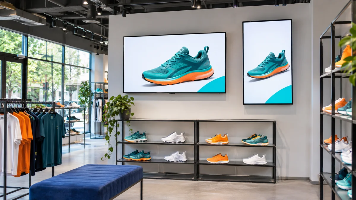
A landscape layout gives you room to place an image and text side by side. Portrait often works better with a sequence from top to bottom. Copy the original elements to a correctly sized canvas, then adjust their scale and spacing. Stretching the finished advertisement to fill the other orientation can distort both pictures and type.
For example, a shoe advertisement could place the product on one side and its name and price on the other in landscape. In portrait, the product could come first, followed by the name and price below it. This is an illustrative layout: adapt it to the image and audience while keeping the product and offer conditions clear in both versions.
Review image crops and both language versions
Choose an image that can be cropped in either orientation, with enough space around the important subject. Test the crop before approving the image; part of the product may disappear when a landscape composition becomes portrait. Keep logos and prices away from image edges if the image will be cropped to fill the display.
For Arabic text, check joined letters, punctuation and numbers in the exported file as well as the design software. For English, adjust line breaks to suit the words. The two languages do not need the same number of lines; they need a clear information order and comfortable spacing.
Test readability and motion on the actual screen
Export a sample and view it from the customer’s position under normal site lighting. Read the smallest important information from the furthest expected viewing point, and check reflections and cropped edges. A phone or laptop preview helps review the content, but the installed screen shows whether it is readable at the intended size and distance.
For video or a playlist, watch a full cycle. Allow time to read each message before it changes, and check that motion leaves prices and directions visible. Test video format and resolution on the intended player. A clear static version may be a better choice when the message benefits from staying on screen.
A checklist before exporting both versions
Name files by campaign, orientation and language, and keep the editable version. When a price or image changes, this helps you update the right file and avoid publishing an older version.
- Dimensions and orientation match the actual display area.
- Images are undistorted, and crops keep important parts of the product visible.
- The heading, price or instruction is clear from the viewing position.
- Arabic and English have both been checked after export.
- Each message stays visible long enough to read, with motion supporting it.
- The file has been tested on the screen and player before rollout.
Download the checklist
Record each check and your team’s notes in a ready-to-use spreadsheet. Open it in Excel or Google Sheets.
Download checklist CSVFind your display setup guide
Compatibility depends on the model, firmware and player. Check the relevant guide before subscribing.